

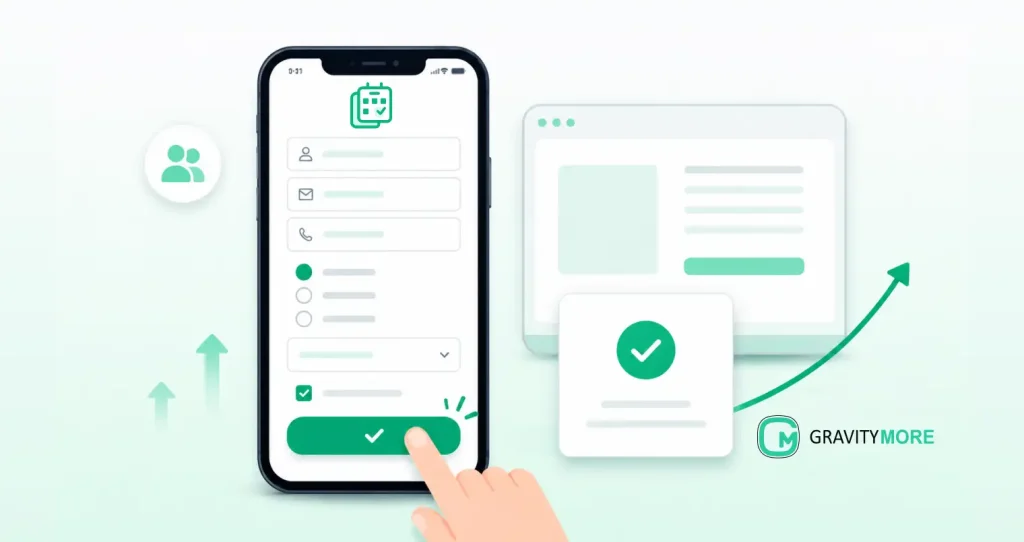
More than half of web traffic now comes from mobile devices. Many websites still treat mobile form design as an afterthought. The result is predictable. Visitors land on a page, tap into a form, hit friction, and leave. Mobile-friendly forms give people a faster and easier way to complete actions on a phone.
They load quickly, use readable text, fit smaller screens, and make every field easy to tap with a thumb.
For WordPress site owners, Gravity Forms already provides a strong foundation. The difference between average and high-converting forms usually comes down to layout choices, field selection, page speed, and user experience details.
If you use Gravity Forms for lead generation, registrations, quote requests, or customer inquiries, improving the mobile experience can directly increase completed submissions.
Why Mobile-Friendly Forms Matter for Gravity Forms Users
A mobile visitor behaves differently than a desktop visitor.
They’re often multitasking, using a smaller screen, dealing with slower internet, or filling out a form while moving between tasks. Every extra step increases the chance they’ll abandon the process.
Common problems include:
- Small buttons that are difficult to tap
- Forms with too many fields
- Slow-loading scripts
- Error messages that are hard to find
- Multi-column layouts that become confusing on mobile screens
Research consistently shows that a large share of form submissions now happens on mobile devices. When a form feels difficult to complete on a phone, completion rates drop.
For Gravity Forms users, this has consequences beyond conversions.
Poor mobile experiences can increase bounce rates, reduce engagement, and create usability issues that affect how visitors interact with your site. A form page that loads slowly or frustrates users often performs worse than a streamlined alternative.
How Google and UX Overlap on Mobile Forms
Google evaluates pages through a mobile-first lens.
When visitors struggle with your forms, engagement signals suffer. Slow scripts, layout shifts, and frustrating interactions can contribute to poor user experience metrics.
Form optimization won’t solve every SEO problem. It can improve the experience on some of the most important pages on your site.
If your lead generation strategy depends on Gravity Forms, mobile usability deserves the same attention as page content and traffic acquisition.
Mobile-Friendly Forms vs Responsive Gravity Forms
Many site owners assume that responsive forms and mobile-friendly forms mean the same thing. They don’t.
A responsive form adjusts its size to fit different screen widths. That’s only the starting point. Mobile responsive forms fit the screen. Mobile-friendly forms fit the user’s behavior.
A truly mobile-friendly Gravity Form focuses on:
- Single-column layouts
- Easy thumb navigation
- Readable labels
- Large tap targets
- Shorter completion times
- Clear validation messages
- Mobile-friendly input types
A form can technically be responsive and still feel frustrating to use on a phone.
Common UX Problems on Gravity Forms Mobile Views
Several issues appear repeatedly during mobile form audits.
Tiny checkboxes and radio buttons
Users frequently miss selections because touch targets are too small.
Placeholder-only labels
When placeholders disappear during typing, users lose context and make mistakes.
Long scrolling forms
A 15-field contact form may work on desktop. On mobile, it often creates unnecessary friction.
Crowded layouts
Side-by-side fields that look neat on desktop can become awkward and difficult to navigate on smaller screens.
Addressing these issues often produces faster gains than redesigning the entire page.
Planning Mobile-Friendly Forms: Goals, Audience, and Context
Every form should have one clear purpose.
A quote request form collects leads. A newsletter form collects subscribers. A registration form gathers attendee information.
When a form tries to do several jobs at once, field counts grow and completion rates usually decline.
Before editing a Gravity Form, ask:
- What information do I absolutely need?
- What information can wait until later?
- What action do I want the visitor to take?
The answers often reveal fields that can be removed immediately.
Decide What You Can Remove on Mobile
Mobile users reward simplicity. For example, a basic consultation request form may only need:
- Name
- Phone number
- Message
Fields such as company size, budget range, industry, and referral source can often be collected later.
Every field should justify its existence.
If a field doesn’t directly support the form’s goal, consider removing it.
Shorter forms generally produce higher completion rates because they require less effort from the visitor.
Gravity Forms Layout Best Practices for Mobile UX
Layout determines how quickly users can move through a form.
Small changes in structure often produce noticeable improvements in completion rates.
Use Single-Column Layouts and Logical Field Order
Single-column layouts work best on mobile devices.
Users naturally move downward through the form without needing to scan across the screen.
A typical field order might look like this:
- Name
- Phone
- Message
- Submit
This sequence feels predictable and reduces confusion.
When possible, avoid placing fields side by side on mobile screens.
Even when Gravity Forms supports multi-column layouts, a single-column structure usually creates a smoother experience for mobile visitors.
Make Buttons and Tap Targets Thumb-Friendly
Submit buttons should be easy to find and easy to tap.
Recommended practices include:
- Larger button height
- Extra horizontal padding
- Clear button text
- Adequate spacing around buttons
A visitor should never need to zoom in to submit a form.
Example CSS:
.gform_button,
.gform_next_button,
.gform_previous_button {
padding: 14px 24px;
font-size: 16px;
min-height: 44px; }
This small adjustment often improves usability immediately.
Typography, Spacing, and Contrast for Small Screens
Text that looks fine on desktop can become difficult to read on mobile.
For most Gravity Forms:
- Use at least 16px field text
- Use clear labels
- Add spacing between fields
- Ensure error messages stand out visually
Visitors should understand each field without zooming or squinting. Good readability reduces mistakes and speeds up form completion.
Reducing Friction: Fewer Fields and Smarter Flows in Gravity Forms
If your form feels like work, mobile users leave.
Most conversion gains come from removing unnecessary effort. You don’t need a complete redesign to improve form submission rate. In many cases, reducing the number of decisions, fields, and scrolling steps produces the biggest lift.
Shorten Your Forms and Remove Non-Essentials
Start by identifying the minimum information required to complete the next step.
For example, a quote request form often performs better with:
- Name
- Phone number
- Project details
Many businesses also ask for company size, budget, industry, timeline, and referral source. Those fields may be useful, but they aren’t always necessary during the first interaction.
Longer forms create more opportunities for hesitation and abandonment. A visitor who sees 12 fields on a phone may decide to come back later. Many never do.
Review each field and ask:
- Will I use this information immediately?
- Does this field affect the next action?
- Can I collect this later by email or during a call?
Removing even 2 or 3 fields can make a form feel significantly lighter on mobile.
Use Conditional Logic Instead of Always-Visible Fields
Gravity Forms includes conditional logic, and it’s one of the most effective ways to optimize forms for mobile.
Instead of showing every possible field upfront, display additional questions only when they’re relevant.
Example:
Question: “Are you requesting services for a business?”
If Yes:
- Company name
- Team size
- Business website
If No:
- Hide those fields completely
This approach keeps the initial form short and reduces cognitive load. Mobile users see only the questions that matter to them.
Other useful conditional logic patterns include:
- Showing upload fields only when documents are required
- Displaying appointment options only after a service is selected
- Revealing advanced questions only for qualified leads
The result is a cleaner form without sacrificing data quality.
Split Long Forms into Mobile-Friendly Multi-Step Flows
Some forms genuinely need a lot of information. Applications, registrations, onboarding forms, and detailed surveys often can’t be reduced to 4 fields.
In those cases, break the form into multiple steps.
A typical mobile-friendly flow might look like this:
| Step | Focus |
|---|---|
| Step 1 | Basic contact details |
| Step 2 | Project or registration information |
| Step 3 | Uploads or additional details |
| Step 4 | Review and submit |
Multi-step forms work well on mobile because users focus on one small task at a time.
Gravity Forms supports multi-page forms with progress indicators. This helps visitors understand where they are in the process and how much remains.
For forms that include file uploads, tools such as GravityMore’s Smart Uploads can make the upload experience smoother on mobile devices by giving users previews and clearer feedback before submission.
The goal is simple: keep each screen focused, reduce scrolling, and make progress feel manageable.
Quick win checklist
Apply today
- Remove fields that aren’t required immediately.
- Use Gravity Forms conditional logic to hide unnecessary questions.
- Convert long forms into multi-step flows with progress indicators.
- Keep each mobile screen focused on a single task.
How to Optimize Input Types and Keyboards in Gravity Forms
Gravity Forms already includes field types designed for mobile devices. Using them correctly makes forms easier to complete and reduces submission errors.
Small changes here can significantly improve form submission rate, especially on lead generation and registration forms.
Choose the Right Field Types to Trigger Mobile Keyboards
One of the most common mistakes is using a generic text field for every input. Mobile operating systems automatically display different keyboards based on the field type.
For example:
| Information Needed | Recommended Gravity Forms Field |
|---|---|
| Email Address | Email Field |
| Phone Number | Phone Field |
| Quantity or Age | Number Field |
| Website URL | Website Field |
| Date Selection | Date Field |
When someone taps an email field, their keyboard immediately shows the @ symbol and other commonly used email characters.
When they tap a phone field, they see a numeric keypad. This removes unnecessary taps and reduces typing errors.
Common Example
Bad setup:
Name
Phone
Better setup:
Name → Single Line Text
Email → Email Field
Phone → Phone Field
It feels faster because it is faster.
Adding HTML5 Input Attributes With Gravity Forms Filters
Gravity Forms handles many mobile-friendly settings automatically. You can push things further with HTML5 attributes.
Useful attributes include:
- autocomplete
- inputmode
- autocorrect
- autocapitalize
These attributes help browsers understand what type of information users are entering.
For example:
- Email fields can suggest saved email addresses.
- Numeric fields can display a number keypad.
- Address fields can use browser autofill.
A simple Gravity Forms filter can add these attributes without modifying core plugin files.
Example:
add_filter( ‘gform_field_content’, ‘gm_mobile_inputmode’, 10, 5 );
function gm_mobile_inputmode( $content, $field, $value, $entry_id, $form_id ) {
if ( $field->type === ‘number’ ) {
$content = str_replace(
‘<input’,
‘<input inputmode=”numeric”‘,
$content);}
return $content; }
P.S. If you’re not comfortable editing theme files, use a code snippets plugin and test changes on a staging site before publishing.
Enable Browser Autofill Wherever Possible
Typing addresses, names, phone numbers, and emails on mobile can be tedious. Modern browsers can fill these details automatically when fields are configured correctly.
Good candidates for autofill include:
- First name
- Last name
- Email address
- Phone number
- Company name
- Street address
For many forms, browser autocomplete removes half the work.
Inline Validation and Clear Error Messages on Mobile
Few things frustrate users more than submitting a form and seeing a generic error message. Clear validation helps users fix mistakes immediately.
Examples include:
- Invalid email format
- Missing required field
- Phone number entered incorrectly
- File upload exceeds size limits
The best validation messages are:
- Short
- Specific
- Easy to see
Poor example:
Error occurred.
Better example:
Please enter a valid email address.
Make Error Messages Easy to Spot
Error messages often blend into the page design. Increase visibility by:
- Using larger text
- Adding spacing around messages
- Using clear contrast
- Positioning messages near the affected field
Example CSS:
.validation_message {
font-size: 16px;
margin-top: 8px; }
.gfield_error input,
.gfield_error textarea {
border-width: 2px; }
The faster they identify the problem, the more likely they are to finish the form.
Mobile Keyboard and Validation Checklist
Before publishing mobile-friendly forms, verify that:
- Email fields trigger an email keyboard.
- Phone fields trigger a numeric keypad.
- Number fields use numeric input.
- Browser autofill works correctly.
- Validation messages appear near the affected field.
- Error messages are readable without zooming.
These improvements take little time to implement and can remove a surprising amount of friction from mobile-friendly forms.
What are the Top Performance Tips for Mobile-Friendly Forms
A mobile form can look perfect and still lose conversions if it loads slowly.
If you’re working on WordPress mobile-friendly forms optimization, performance deserves the same attention as design.
Minimize Heavy Fields and Scripts on Mobile
Every field should justify the resources it consumes. Some Gravity Forms features create more overhead than others:
- Large file upload fields
- Multiple third-party integrations
- Complex conditional logic chains
- Embedded maps
- Autocomplete services
- Tracking scripts firing on form pages
For example, a simple contact form should not load the same resources as a multi-step job application form with document uploads.
Review each form and ask:
- Is every integration necessary?
- Are there fields users rarely complete?
- Can functionality be moved to later steps?
Keep Form Pages Focused
Dedicated landing pages frequently outperform pages filled with distractions. A mobile visitor arriving to complete a form should not compete with:
- Multiple popups
- Autoplay videos
- Large image sliders
- Excessive widgets
For lead generation-enabled mobile-friendly forms, a focused page usually creates a smoother experience.
How to Design Mobile-Friendly Forms Using Gravity Forms
Lead generation forms have one job. Collect contact information with the least amount of friction possible.
Many websites make the process harder than necessary by asking for too much information too early.
Keep Mobile Opt-In Forms Focused and Non-Intrusive
Most email opt-in forms only need one field. Sometimes two. A visitor interested in a newsletter, guide, or webinar rarely needs to provide:
- Company size
- Job title
- Revenue
- Industry
- Phone number
Every additional field increases effort.
A simple example:
High-friction opt-in
- First name
- Last name
- Phone
- Company
- Industry
- Team size
Low-friction opt-in
- Email address
The second version usually generates more submissions because it asks for less commitment.
Write Clear CTA Copy
The submit button matters. Generic labels such as:
- Submit
- Send
provide little context.
More specific alternatives work better:
- Get the Guide
- Reserve My Spot
- Send My Quote
- Start My Trial
Users should understand exactly what happens after clicking.
Using Two-Step Opt-In Flows With Gravity Forms
Two-step opt-ins reduce perceived effort. Instead of showing the form immediately, visitors first click a button.
Example:
Step 1
“Download the Checklist”
Step 2
The Gravity Form appears in a pop-up or dedicated section. This process creates a small commitment before presenting the form.
Many marketers use this approach for:
- Lead magnets
- Webinar registrations
- Email subscriptions
- Free consultations
Gravity Forms works well with page builders and popup plugins that support this workflow.
Keep Each Step Short
When using multi-step lead generation forms:
- Ask for contact information first.
- Collect additional details later.
- Display progress indicators when appropriate.
Users are more likely to complete a sequence of short tasks than a single overwhelming form.
Placement and Repetition of Forms on Long Mobile Pages
Long-form content often generates strong intent. The problem is that many visitors reach the end of the page and never see the form again.
Strategic placement solves this. Good locations include:
- Near the top of the page
- After key benefits
- Near testimonials
- At the end of the content
For longer landing pages, repeating the same form or CTA can increase visibility without adding friction.
Sticky buttons can also work well for mobile-friendly forms without blocking content.
Accessibility and Trust Signals for Mobile Form Completion
Visitors decide within seconds whether they trust a form enough to submit personal information.
Accessibility and trust signals influence that decision. Both also improve usability for all visitors.
Make Forms Accessible on Small Screens
Accessibility improvements often make forms easier for everyone. Start with the basics:
Use Visible Labels
Labels should remain visible while users type.
Placeholder-only forms create confusion when visitors need to review their entries.
Good:
Email Address
[________________]
Poor:
[Enter email address]
Support Keyboard and Screen Reader Navigation
Users should be able to move through fields logically. Each field should have:
- A clear label
- A meaningful error message
- A visible focus state
These improvements help screen reader users and improve usability on mobile devices.
Make Touch Targets Large Enough
Checkboxes, radio buttons, and buttons should be easy to tap.
Small touch targets increase accidental selections and user frustration.
Use Microcopy and Trust Cues Near the Form
People hesitate when forms request personal information. A few words of reassurance can remove uncertainty.
Examples include:
Near email fields
We’ll only use your email for updates related to your request.
Near contact forms
Response time: usually within 1 business day.
Near file uploads
Accepted formats: PDF, JPG, PNG.
Display Relevant Trust Signals
Useful trust cues include:
- Privacy statements
- Security badges where appropriate
- Customer testimonials
- Review ratings
- Company contact information
Trust signals work best when they support the user’s decision at the moment they’re completing the form.
What is the Mobile Testing Checklist for Gravity Forms
Use this checklist before publishing any important Gravity Form for mobile-friendly forms.
Layout and readability
- Does the form stay in one column on smaller screens?
- Can users complete it without horizontal scrolling?
- Are labels visible above every field?
- Is field text at least 16px, so mobile browsers do not zoom in when users tap an input?
- Is there enough vertical space between fields to prevent accidental taps?
Buttons and navigation
- Are submit, next, and previous buttons at least 44px high?
- Can users tap buttons with one thumb?
- Is the primary action visible without excessive scrolling?
- Do multi-page forms show clear progress indicators?
- Does the form keep entered data when users move between steps?
Fields and keyboard behavior
- Does the email field open an email keyboard?
- Does the phone field open a numeric keypad?
- Do number fields use numeric input?
- Does browser autofill work for names, emails, addresses, and phone numbers?
- Are optional fields clearly marked?
Validation and submission
- Do error messages appear next to the affected field?
- Can users read error messages without zooming?
- Are required fields limited to information you need at that stage?
- Does the confirmation message explain what happens next?
- Does the form send users to the correct thank-you page, confirmation message, or next step?
Speed and device testing
- Does the form load quickly on a 4G connection?
- Do file uploads work on both iPhone and Android devices?
- Do conditional logic fields appear and disappear correctly?
- Do third-party integrations delay the form or block submission?
- Does the form work in Chrome Mobile and Safari Mobile?
Run this checklist on your highest-value forms first. Contact forms, quote forms, registration forms, checkout-related forms, and lead generation forms usually deserve priority.
GravityMore Smart Uploads for Mobile File Uploads

GravityMore Smart Uploads gives users a clearer upload process by allowing file previews before submission. This is useful when uploaded files affect the next step of a workflow.
A contractor quote form, for example, may ask users to upload photos of a repair issue. A preview lets the user confirm that the correct image is attached before submitting the request.
Use Smart Uploads when file accuracy matters. A basic contact form does not need it.
GravityMore Preview Submission for longer forms
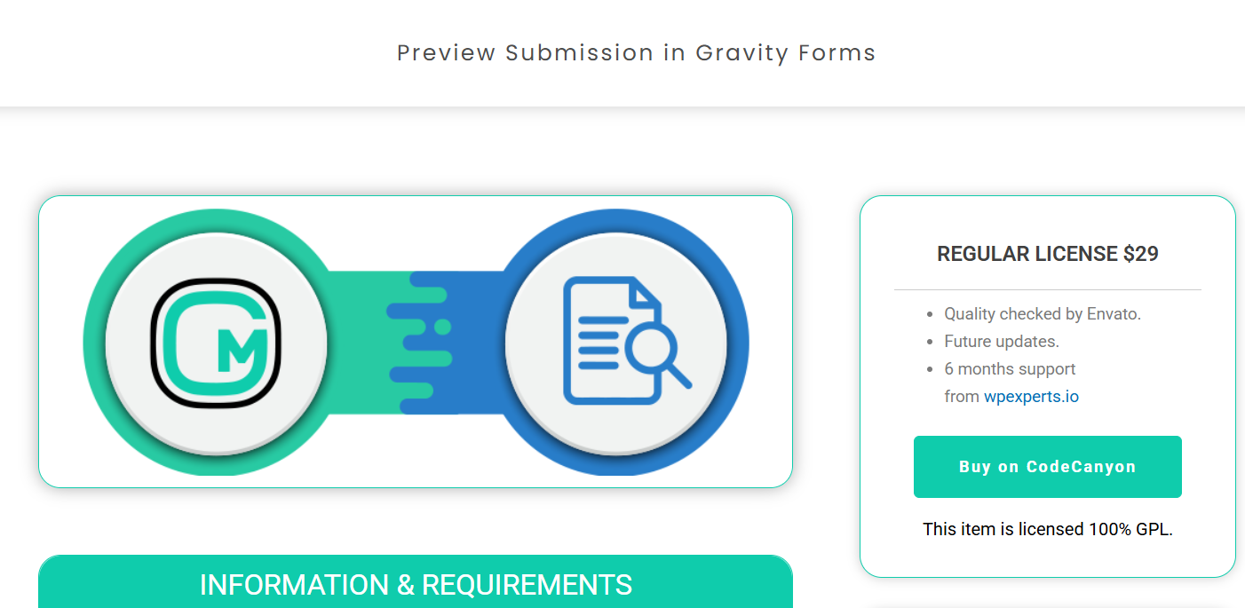
GravityMore Preview Submission is useful for forms where corrections after submission create extra work. Registration forms, service applications, and detailed client intake forms are common examples.
Keep the preview screen simple. Users should be able to review entries, return to the relevant step, make changes, and submit without confusion.
Ending Note on Mobile-friendly Forms
Mobile-friendly forms reduce the effort required to submit information from a phone. Start with one high-value Gravity Form. Remove unnecessary fields, use a single-column layout, set the correct field types, improve button sizes, and test the full flow on real devices.
Use conditional logic and multi-page forms when the form needs more information. Add tools such as Smart Uploads or Preview Submission only when they solve a specific user problem. Review your mobile form completion rate after making changes. The data will show which forms need further work.